

Gamescom event Brochure
Skills Demonstrated: Analyzing Existing Brand Identity & Applying Visual Language Accordingly / Text Contrast & Colour Theory / Typographic Hierarchy
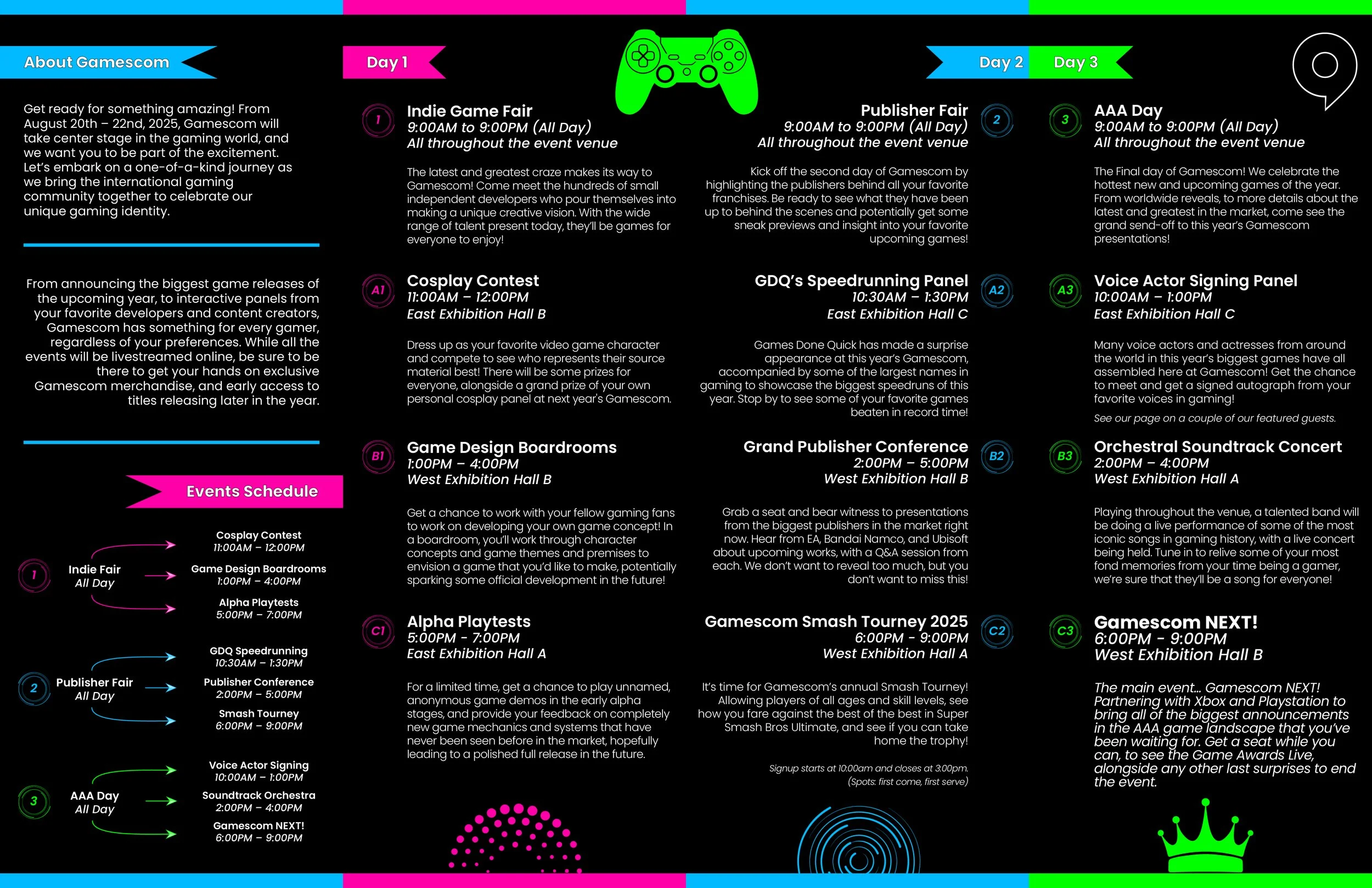
For this project, my responsibility was investigating the brand visual identity for a festival or event of my choice, and creating a branded brochure that appropriately conveys the brand’s tone and messaging. The project is primarily focused on clean type treatment, ensuring clear readability and text hierarchy.
My role here involved analyzing different pieces of Gamescom media to understand the brand’s values and graphical elements used, and applying them properly to my design, alongside creating detailed text and colour styles in InDesign to ensure proper brand expression. The file was also created ready to print, which ensured proper attention to TAC%, Bleeds, CMYK Profiles, and more.
This project was presented in a professional manner, which was also designed to match with the appropriate brand aesthetics. Proper inclusion of a grid system was also required to ensure proper alignment of graphics and text resting on the page baselines. I recommend looking through the presentation below to visually acknowledge the brand applications added.
Note: This project is not professionally affiliated with Gamescom and was done for academic purposes only; I do not represent Gamescom in any manner.